Branding
UX
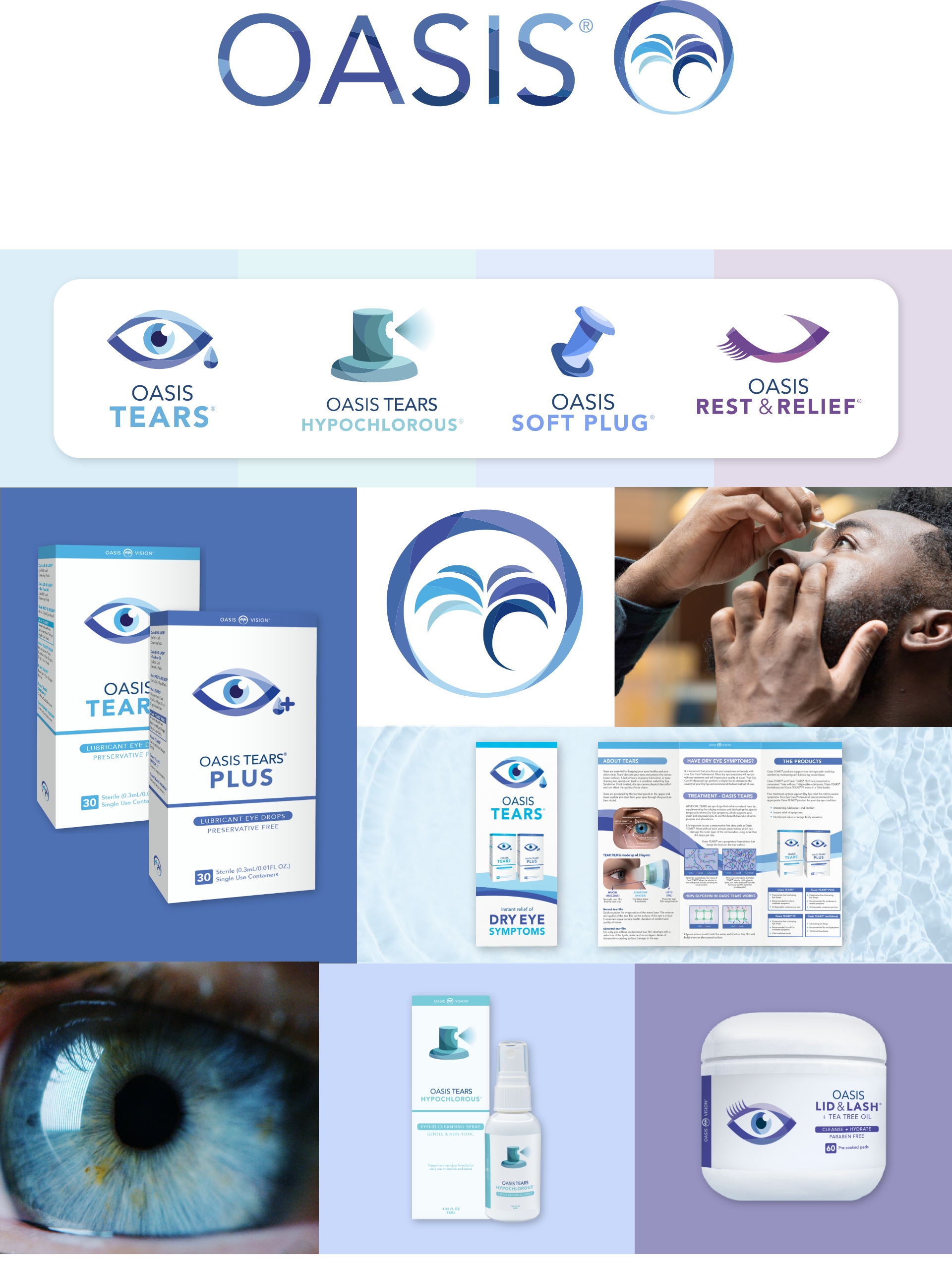
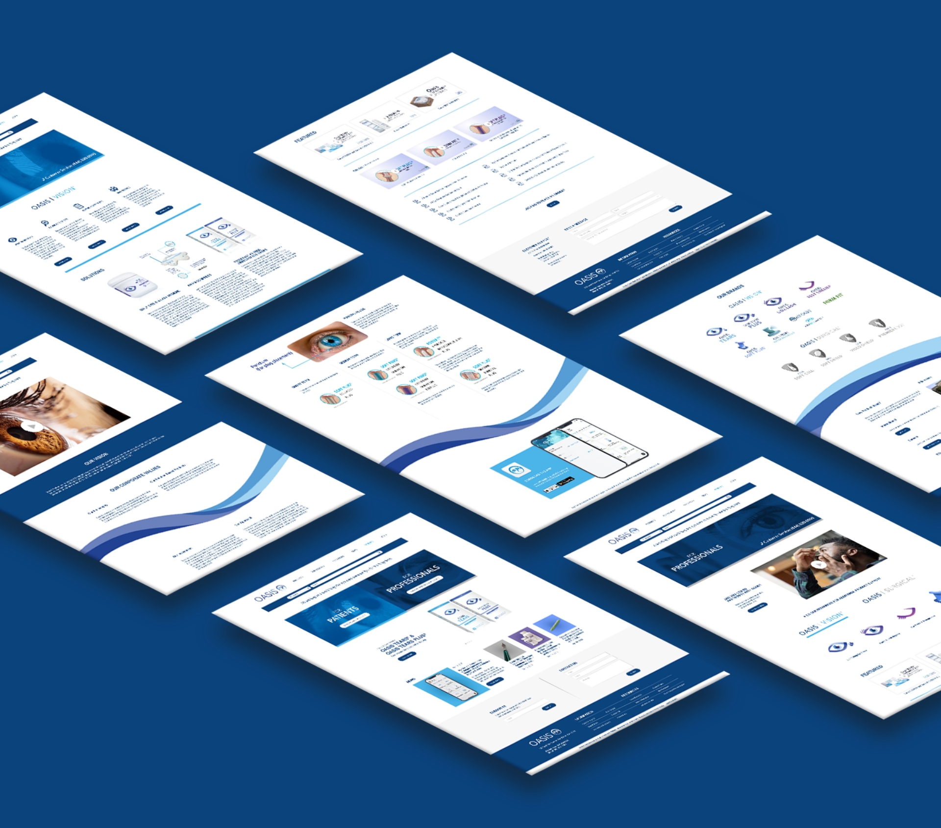
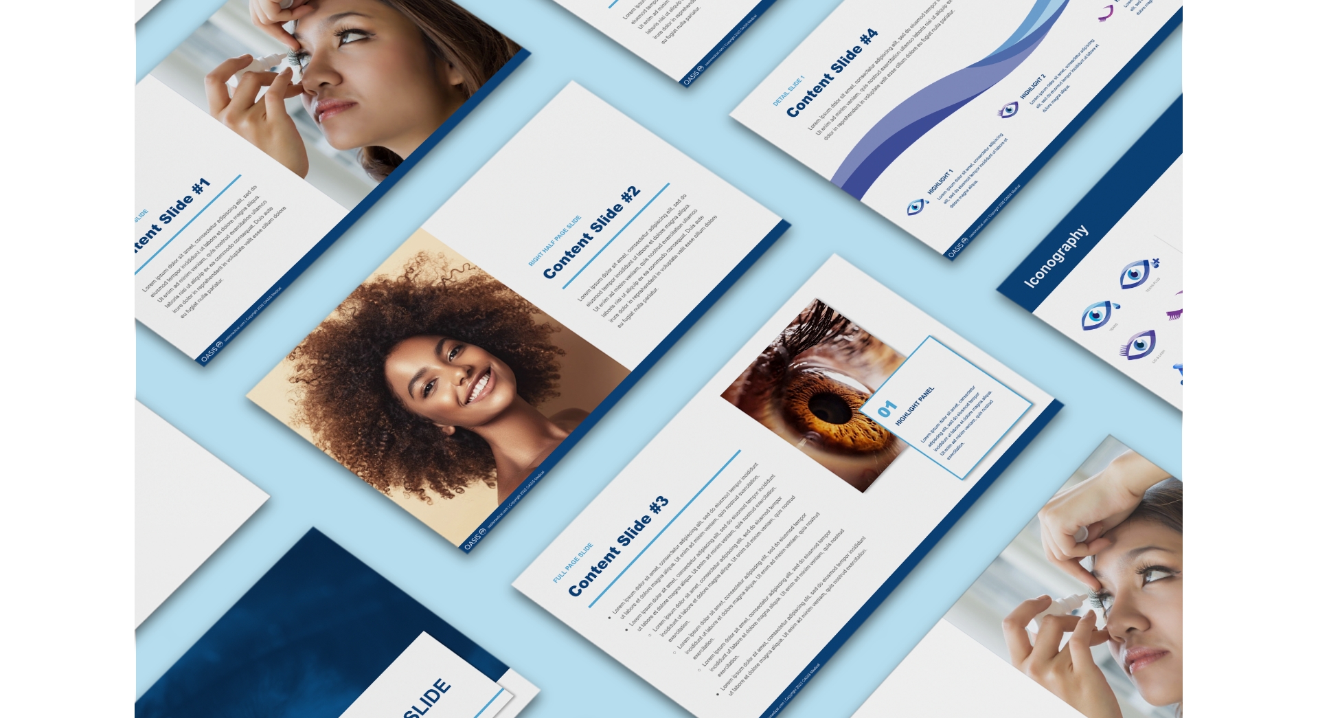
Complete brand re-fresh including overall look and feel, positioning, tagline, branding and logo design, sitemap organization, wireframes, educational assets, packaging, and iconography.
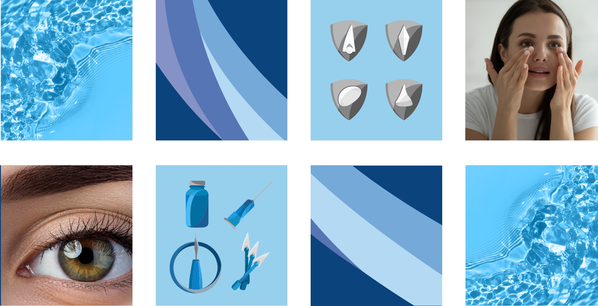
Oasis Medical reached out to The Buddy Group to refresh their brand look and feel through their logo, packaging, and website UX, as well as educational assets to aid clients and professionals that rely on Oasis for their needs. The vibrant and invigorating colors that represent Oasis, and the strong, bold iconography created by The Buddy Group captures the earnest passion of the Oasis brand.

Complete brand re-fresh including overall look and feel, positioning, tagline, branding and logo design, sitemap organization, wireframes, educational assets, packaging, and iconography.
The Buddy Group brought Oasis Medical’s North Star to life visually by strategically highlighting brand personality traits that are lively, earnest, innovative, and supportive. By invigorating the brand, The Buddy Group re-established Oasis as a supportive and central part of the eye-care community, and transformed Oasis from a search-and-transact business, to a more engaging and relationship-driven service.

With a refreshed look and guiding message to, “nourish and sustain the eye-care community for the long term”, Oasis has solidified their position as an industry leader in innovation and empowered service to their customers and the eye-care community as a whole.

